
12 Small Home Office Paint Color Ideas That Help You Focus
Choosing small home office paint color ideas sounds simple until you are staring at forty white swatches that all look identical in the shop and completely different on your wall. In a tiny office, paint does more than decorate. It decides whether the room feels wide or boxed in, whether you look washed out or clear on video calls, and whether your brain settles into work or keeps scanning the room. This guide walks through 12 colours that genuinely help you focus, grouped by family, with honest notes on light, cost, and who each shade suits best.
There is no single perfect colour, only the right colour for your light, your work, and the size of your room. A soft blue-gray that feels calm in a bright south-facing room can look cold in a north-facing corner, and a warm white that flatters you on camera can turn yellow under a warm bulb. Read the ideas below as a shortlist: narrow it to three, sample them properly, and let your own room decide.
How to Choose a Paint Colour for a Small Home Office
Start with the light, not the swatch. North-facing rooms get cool, steady light all day, so colours read cooler and bluer than the tin suggests. Warm shades balance that out. South-facing rooms get warm, changing light that can make whites glow and pale colours disappear at midday, so slightly muted or cooler shades hold up better. East-facing rooms are bright and warm in the morning and duller later. West-facing rooms do the opposite. Note which way your window faces before you fall for a colour online.
Next, think about the work itself. Deep-focus work like writing, coding, and studying usually suits low-contrast, muted colour — your eyes rest when the walls do not shout. Creative work often enjoys a little more saturation or one stronger wall. If you spend half your day on video calls, your wall is also a backdrop: mid-tone and warm neutral walls flatter skin tones on camera, while very bright white can blow out and very dark walls can make you look shadowy.
Finally, respect the size. Light colours reflect more light and make small offices feel bigger, which is why most of this list leans light and soft. That does not mean small must mean white. A darker accent wall can add depth, and colour-drenching — walls, trim, and door in one colour — removes the visual breaks that chop a tiny room into pieces. Both tricks appear below.
If your layout is fighting you, fix that alongside the colour. Our guide to small home office layout ideas that make a tiny room work harder shows how desk position and storage change what paint can do.
12 Small Home Office Paint Color Ideas That Help You Focus
1. Soft Warm White
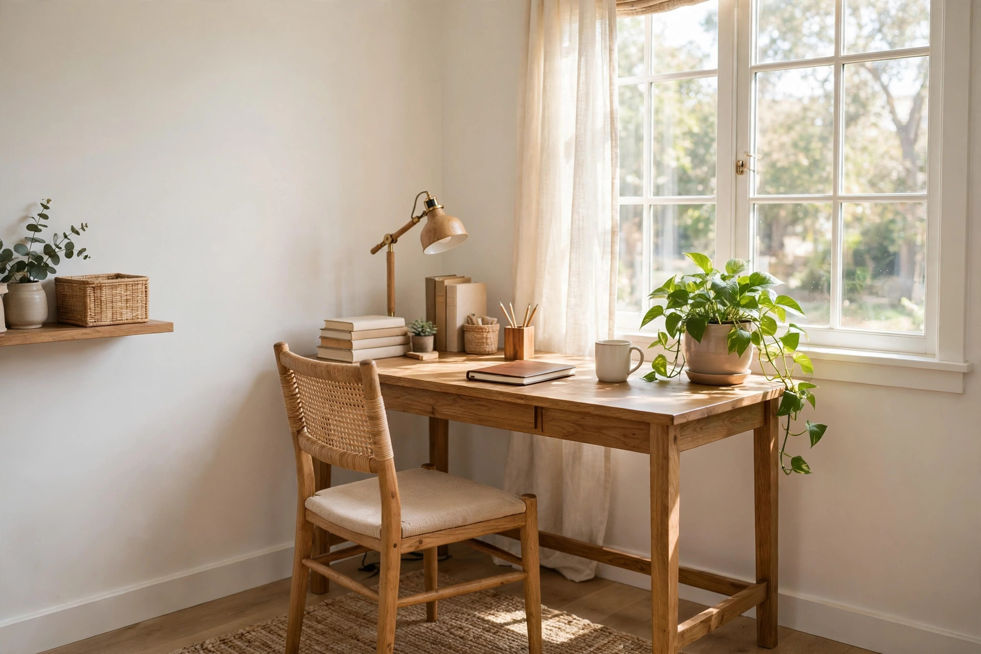
Best for: almost everyone, especially renters and video-call-heavy days. A soft warm white is not stark builder white. It has a gentle warm undertone that keeps a small office bright without feeling clinical. It reflects the most light of any option here, so a windowless or shaded room feels noticeably larger.
In north-facing light, warm white stops the room feeling grey. In strong south-facing light, choose a slightly muted version so it does not glare on screen. Pair it with warm wood and one plant so the room does not read as blank. This is the safest starting point if you cannot decide.
2. Warm Greige
Best for: calm, low-distraction focus and a professional camera backdrop. Greige sits between grey and beige, and the warm versions are a small-office workhorse. Greige has more depth than white, so the room feels finished rather than empty, but it stays quiet enough to disappear while you work.
Greige flatters most skin tones on video calls, which is why so many home workers land here. Watch the undertone: in cool north light it can tip grey and feel chilly, so pick one that leans a touch more beige. Test it beside your desk wood and flooring, because greige shifts against warm and cool floors in opposite directions.
3. Pale Blue-Gray
Best for: deep-focus work and hot, bright rooms. Pale blue-gray is the classic focused-office colour for good reason. Blue tones are widely linked with calm and clear thinking, and the grey in this mix keeps it adult and muted rather than nursery blue. In a small room it still reads light, so you keep the spacious feeling.
This shade shines in south and west-facing rooms where warm afternoon light balances its coolness. In a north-facing room it can feel cold, so warm it up with a timber desk, a warm lamp, and textiles in cream or tan. Keep the rest of the palette low-contrast for the calmest effect.
4. Muted Slate Blue
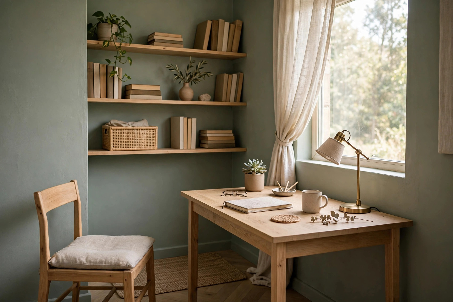
Best for: longer focus sessions and anyone who finds pale colours insipid. Muted slate blue is the deeper cousin of blue-gray. It has enough body to make a tiny office feel intentional and cocooning, without going so dark that the room shrinks. Many people find a mid-tone like this easier to concentrate in than a bright white room that bounces light everywhere.
Use it on all walls in a well-lit room, or on one wall if your light is limited. It looks excellent behind a monitor because the mid-tone reduces the contrast glare between a bright screen and a bright wall. Balance it with light flooring or a pale rug so the base of the room does not feel heavy.
5. Light Sage Green
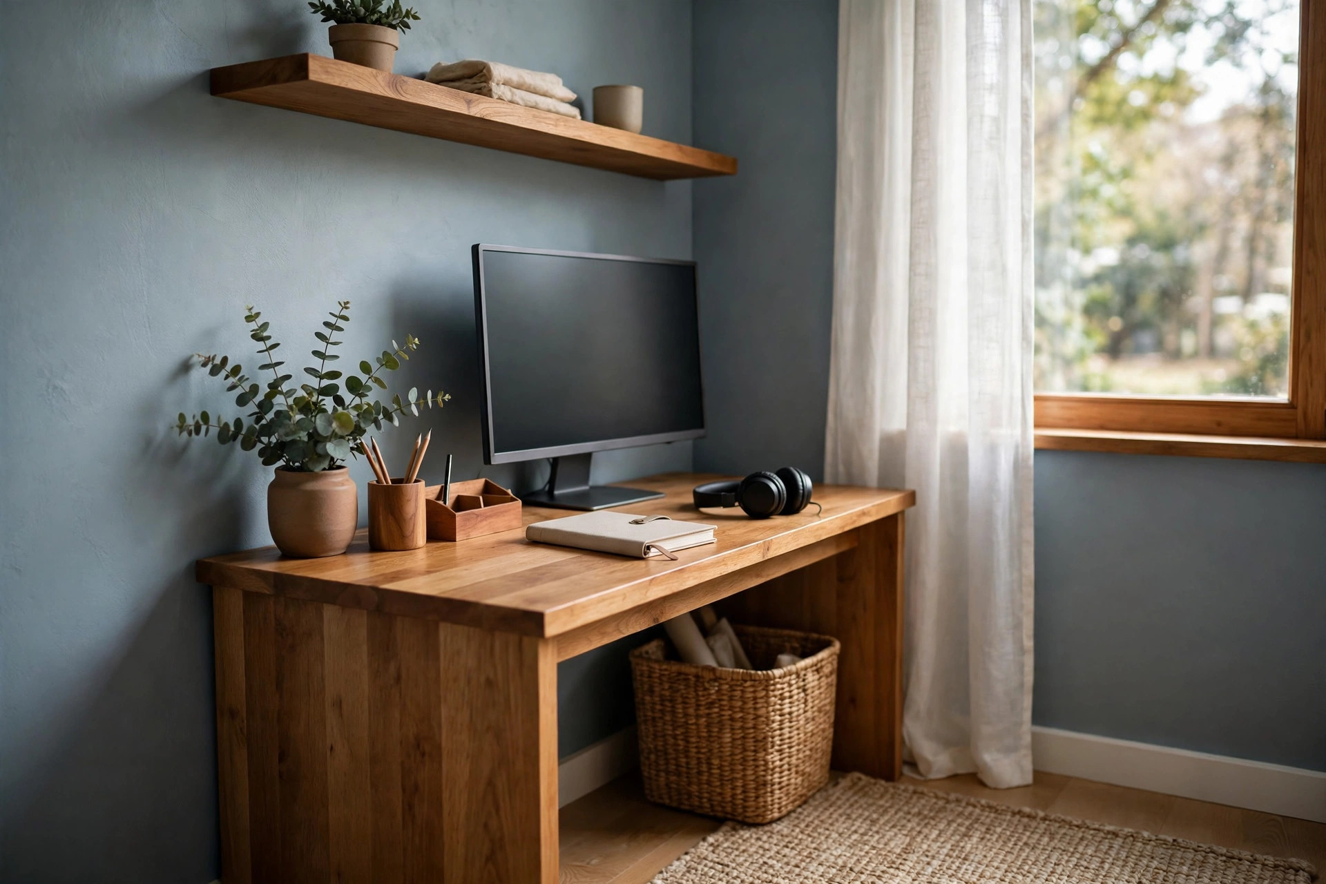
Best for: balanced, steady work and reducing visual fatigue. Sage is a soft grey-green that brings the calm of a garden indoors without any of the distraction of a bright green. It sits comfortably in the middle of the warmth scale, so it works in more light conditions than almost any other colour here.
Sage pairs beautifully with light oak, white shelving, and black metal details, and green tones feel restful when you look up from long screen hours. In cool light choose a sage with a touch more yellow; in warm light, a greyer sage stops it turning too sweet.
6. Eucalyptus Gray-Green
Best for: creative work that still needs calm. Eucalyptus is sage's moodier relative, a grey-green with a blue lean that feels fresh and slightly botanical. It has more personality than sage while staying muted enough for daily work. In a small office it looks particularly good with simple shelving and uncluttered styling.
Because it is a touch deeper, test it carefully in a small or north-facing room — it can go shadowy in poor light. With a good desk lamp and a light ceiling it stays fresh. Pair this shade with the advice in our guide to small home office lighting ideas for bright, glare-free work before you blame the paint for a gloomy corner.
7. Warm Light Stone Gray
Best for: a tidy, architectural feel and open-plan office nooks. Stone gray is warmer and softer than a true industrial grey. In a nook carved from a living room or bedroom, a light stone wall can define the work zone without a hard colour clash with the rest of the space.
The risk with any grey is a cold, flat finish, so avoid blue-heavy greys in north-facing rooms. A warm stone with a faint beige base stays welcoming and hides desk-area scuffs better than pure white. Keep trim in soft white for a clean edge, or drench it as idea 10 explains.
8. Creamy Warm Neutral
Best for: cosy focus and rooms that double as a guest or reading space. A creamy neutral is deeper and warmer than warm white, closer to a pale biscuit or soft linen tone. It wraps a small office in warmth and makes evening work feel calmer under lamplight.
This family flatters wood furniture and woven textures and looks warm and welcoming on video calls. The watch-out is yellow. Under warm bulbs and in south-facing light, a cream can tip too yellow, so sample it at night under your actual lamp as well as by day. If it glows nicely rather than shouting, you have the right one.
9. Warm Taupe and Soft Clay Neutral
Best for: grounded, earthy focus and hiding everyday marks. Taupe and soft clay tones bring an earthy steadiness to a small office. They feel more designed than plain beige, with a hint of brown, mauve, or terracotta in the base depending on the shade. That warmth helps long workdays feel less sterile.
These tones are mid-depth, so in a very small or dark room use them on one or two walls with a warm white elsewhere. They pair well with black accessories, leather, and natural fibres. On camera they read warm and professional, though warm walls plus a warm lamp can make a call look orange, so keep one light source neutral if you can.
10. Colour-Drenched Soft Blue-Gray
Best for: making a tiny, broken-up room feel bigger and calmer. Colour-drenching means painting walls, trim, skirting, and often the door in the same colour. In a small office full of angles, alcoves, and a radiator, those white trim lines chop the room up. Removing them lets the eye travel, and the room feels larger and quieter.
Soft blue-gray is a lovely drenching choice because it is calm at full-room scale; sage and greige drench well too. Use a flatter sheen on walls and satin on woodwork in the identical colour. For that finished feel, our ideas for home office desk styling ideas that look calm on camera show how to dress a drenched room without adding clutter back in.
11. Deep Navy Accent Wall
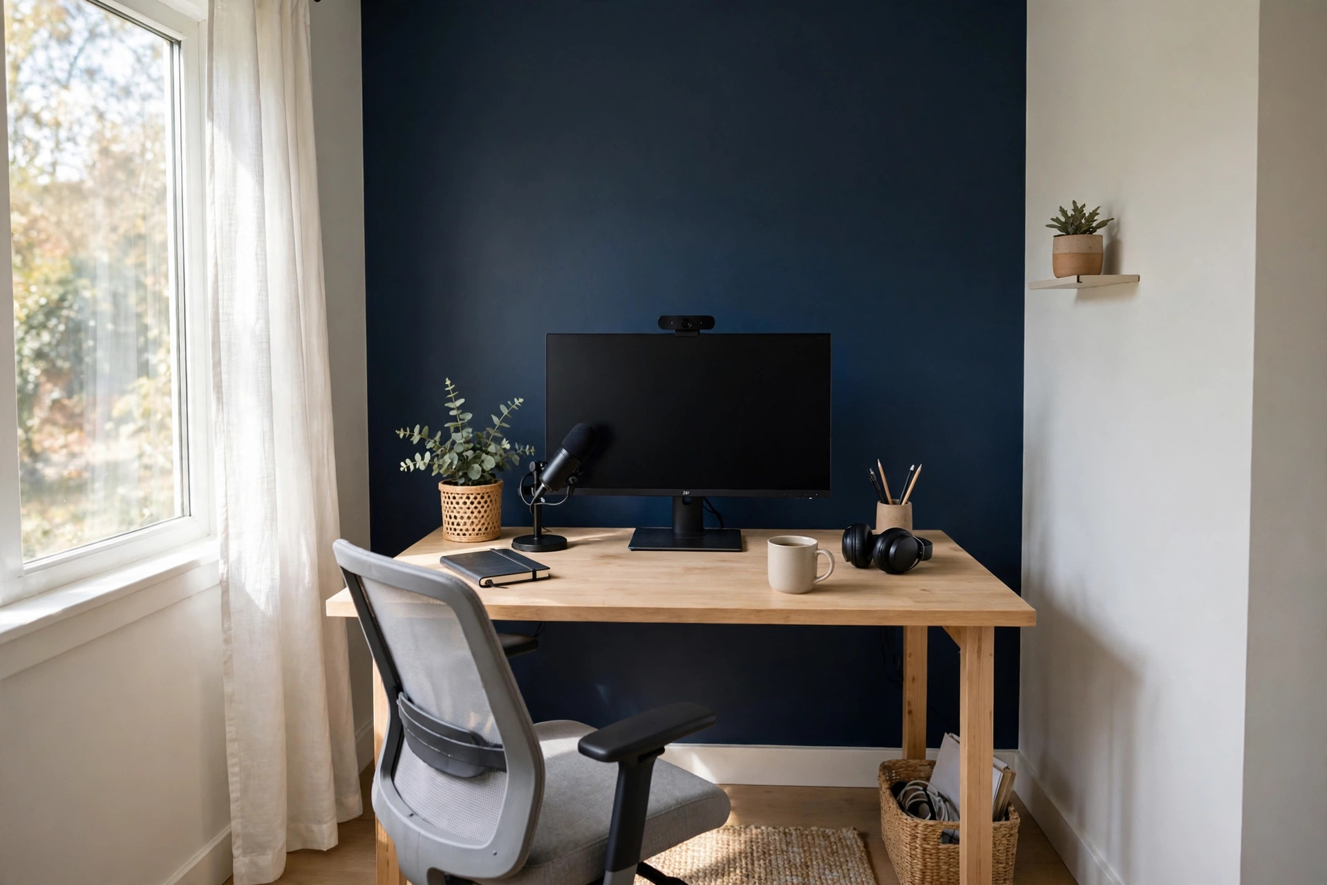
Best for: depth, video-call presence, and defining the desk wall. One deep navy wall behind your desk, with light warm walls elsewhere, is the most reliable accent move in a small office. The dark wall recedes visually, which can make the room feel deeper, and it gives you a rich, professional backdrop that makes you stand out on calls instead of blending into white.
Keep the navy wall to the wall you face or the wall behind you on camera, not both. Feed it light. A desk lamp and a window on an adjacent wall stop it feeling like a cave. Navy also hides monitor cables and shelving shadows better than pale paint. If navy feels too strong, a deep slate or inky blue-green gives a similar effect more softly.
12. Soft Olive Green
Best for: creative work and a warm, characterful small office. Soft olive is warmer and earthier than sage, with a yellow-green base that feels energising without being bright. For writers, designers, and makers who find blue-grey rooms a little flat, olive often unlocks a more enjoyable work mood.
Olive is the most light-sensitive colour on this list. In bright warm light it looks lively and golden-green; in cool dull light it can turn murky, so sampling matters more here than anywhere else. Keep it company with warm white on the ceiling, pale wood, and black or brass details.
What About Finish, Sheen, and Video Calls?
Colour gets the attention, but sheen decides how the room behaves. For office walls, a matte or eggshell finish is usually best. Matte hides small wall flaws and does not reflect your monitor or ring light back at the camera. Eggshell has a faint glow and wipes clean more easily, which helps behind a desk where chairs scuff. Avoid high-gloss on walls. It shows every bump and creates glare on video calls. Save satin or semi-gloss for trim and doors if you are not colour-drenching.
Do a camera test before you commit. Paint a large sample, sit at your desk at your usual call time, and take screenshots in daylight and under your evening lamp. Check three things: does your face look natural, does the wall look like the colour you chose, and is there glare or a bright halo around you? Bright white often fails the halo test and very dark walls fail the shadow test. Most people land happiest in the soft, mid-light range above.
For a deeper dive into choosing shades specifically for a calm camera backdrop, this guide to the best paint colours for a calm, focused home office is a useful second opinion on blues and greens in particular.
How Much Paint Do You Need and What Does It Cost?
Honest numbers help you plan. A standard gallon of good interior paint typically costs about $30 to $60, depending on brand and finish. Premium low-odour and washable formulas sit at the top of that range. One gallon covers roughly 350 square feet with one coat. Most small offices need two coats for an even finish, especially over a darker old colour or fresh filler.
Work it out simply: measure each wall's width times height and add them up, subtracting little for doors and windows. A typical small office with about 300 to 380 square feet of wall needs roughly two gallons for two coats, plus a quart for trim in a separate colour. Add primer if you are covering a strong colour, new plaster, or stains — skipping it over a bold old colour is how a two-coat job becomes a four-coat job.
Budget for extras too: sample pots, tape, a decent roller sleeve, dust sheets, and filler. Samples are the cheapest insurance in the project — a few dollars each can save you repainting a whole room.
How to Sample Paint Properly in a Small Office
Never choose from the card alone, and never judge a colour from one small brush stroke by the door. Light changes colour more than any other factor, and small rooms have light bouncing between close walls, which intensifies a shade.
- Paint large swatches, at least a foot square, on two different walls, including the wall behind your desk.
- Better still, paint a large piece of lining paper or board so you can move the colour into corners and beside the window.
- Look at each sample in morning light, midday light, and under your evening lamp before deciding.
- Sit at your desk with the sample behind you and check it on a video call or phone selfie.
- Hold your desk, flooring, and chair fabric next to the sample, because undertones clash at close range in small rooms.
- Live with the final two samples for at least a full day, including a work session, before buying gallons.
Pay special attention to undertones while sampling. A grey that looks clean at noon can show purple at dusk. A white that looks fresh by the window can show yellow by the door. That is normal paint behaviour, not a faulty tin, and it is exactly why sampling on your own walls beats any photo online.
Common Small Office Paint Mistakes to Avoid
The most common mistake is choosing a colour that is too saturated. Colours intensify when they cover four close walls. The soft blue on a card can become a bold blue box. As a rule, go one step lighter and muddier than your first instinct for a small office, then let accessories add stronger colour if you still want it.
The second mistake is ignoring the ceiling and trim. A stark ceiling against warm walls creates a hard lid on the room. A soft white ceiling, or a drenched ceiling in the same colour, usually works better. The third mistake is one rushed coat over an unprepared wall — filler bumps and the old colour grinning through will bother you every workday.
Finally, do not pick your colour from photos alone. Screens shift colour and their light is not your light. Use photos to build a shortlist; use samples on your own walls to decide.
The Short Version: Which Colour Should You Pick?
If you want the safest all-rounder, choose soft warm white or warm greige. If you want calm focus and your room is bright, choose pale blue-gray or muted slate blue. If you want balance and a restful feel for long screen days, choose light sage or eucalyptus. If your room is cold and north-facing, lean warm: creamy neutral, warm taupe, or soft olive, all properly sampled. If you live on video calls, favour a warm mid-light wall behind you, or try the deep navy accent wall for a stronger backdrop. And if your tiny office is chopped up with trim and angles, try colour-drenching before you assume the room is simply too small.
Paint is the cheapest big change you can make to a home office. One weekend and a colour chosen for your light and your work can make the same small room feel wider, calmer, and far easier to concentrate in. Shortlist three, sample them properly, and trust your own walls.


Comments
Post a Comment